Sneak preview: Hollow Open line style (London Overground)
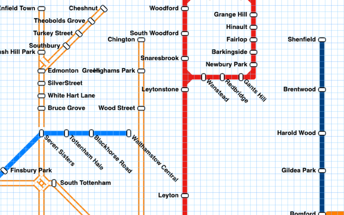
Metro Map Maker launched in 2017, and for most of its run, there was only a single line style available: solid.
Version 7 added several new line styles, plus the ability to mix and match line styles and widths.
One frequently-requested line style has been a line in the style of the London Overground:
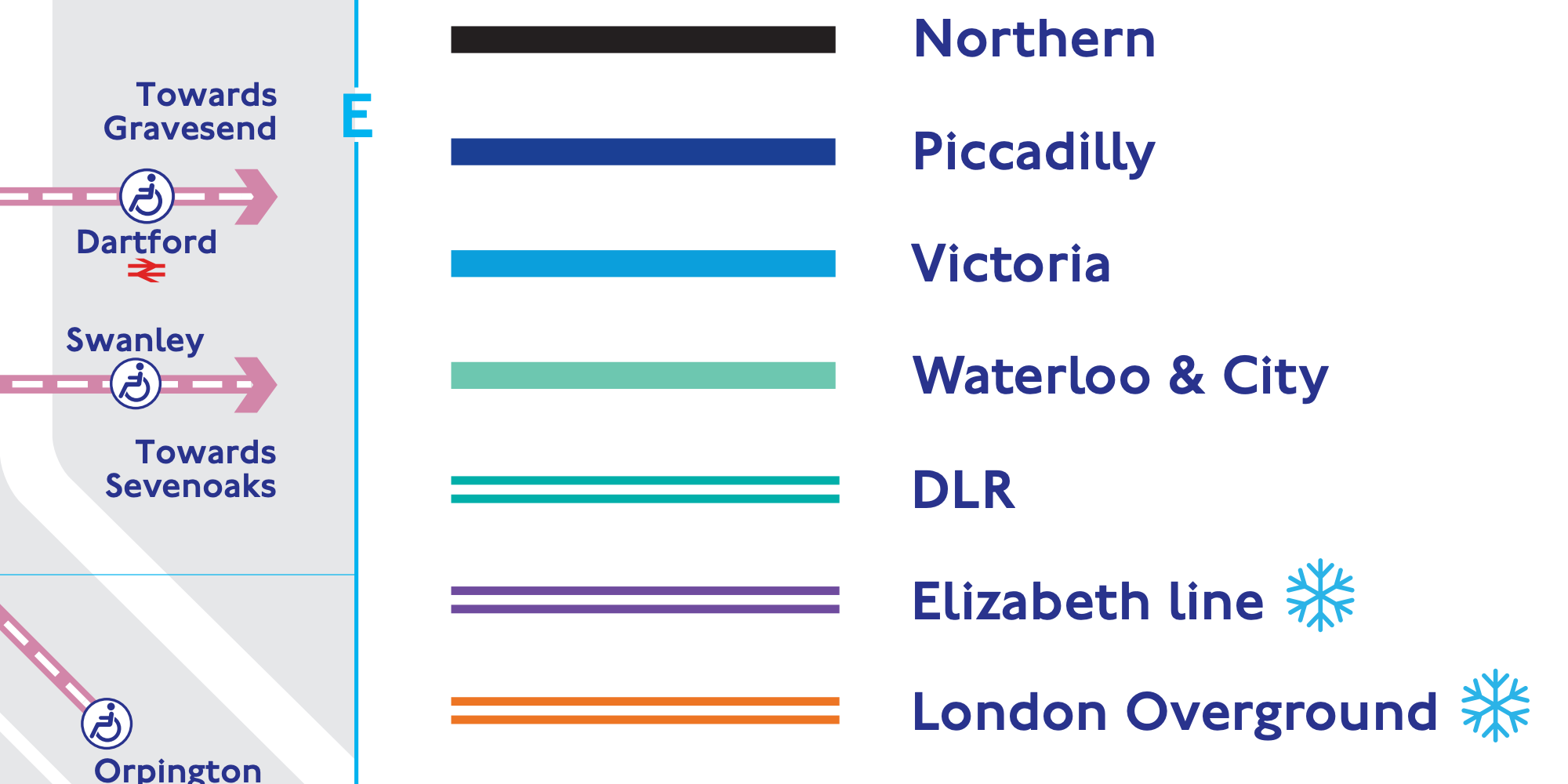
Metro Map Maker version 7.1 will have several new line styles, including one for the London Overground. To generalize the name a bit (and so it fits better on a small button), I'm calling it "Hollow Open".
Here's a sneak preview of how it looks in Metro Map Maker:
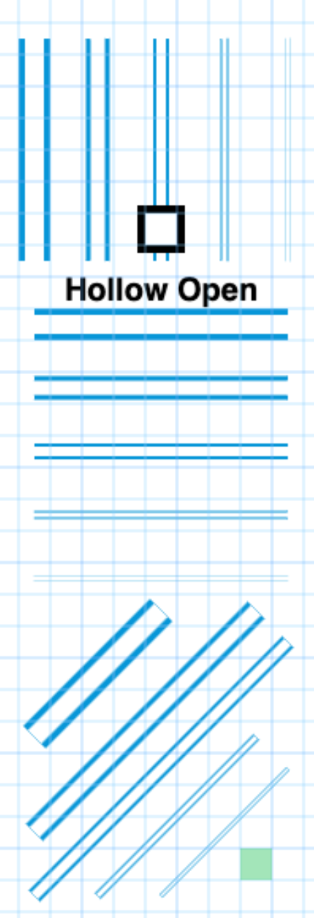
Initially, I was concerned that the lines wouldn't look distinct enough at different line widths. Now that they're in front of me, I think there was no reason to worry – the lines look good.
Every combination should look good
One concern I still have though is the smallest line widths are probably too fine to be useful, and I might take those back to the drawing board to see if I can come up with something better.
When releasing a new station style or line style, I think it's important to make sure that every version and combination of something looks reasonably good. That's why when using the Rectangle station style, the station markers will look different based on the width of the line it sits on:
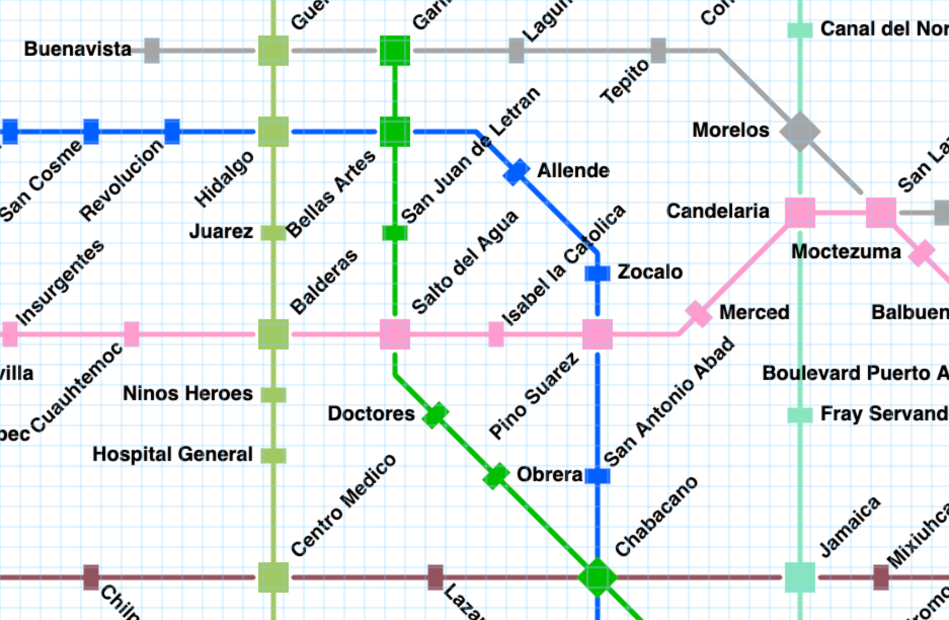
Drawing the station markers in the color of the line they sit on looks very nice, but on thick lines, you wouldn't be able to see the station at all. That's why at 50% line width and higher, rectangle station markers are instead drawn in black and white:
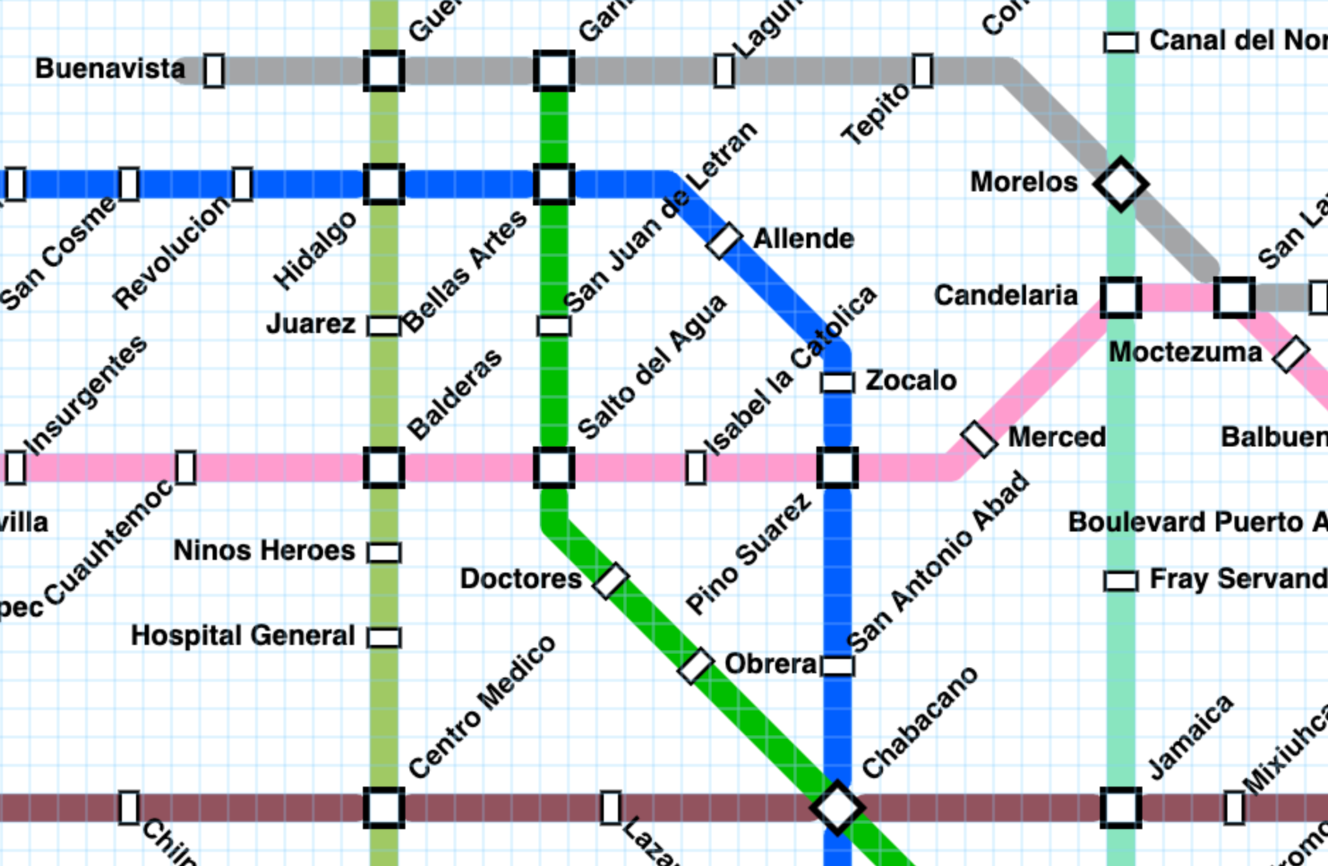
(Both screenshots modified from https://metromapmaker.com/map/BuVWqkWg)
Using this principle, I might end up re-working the hollow lines at the smallest line widths. I also don't like how the diagonal hollow lines show a very slight (1 pixel or so) line at the edges.
These don't show up in the SVG (print-quality) rendering, and it may be a great deal of trouble to remove them, so I might not bother – most of the time they'll be covered by a station marker anyway. But if it's an easy fix, it's one I'd like to do!
I hope you'll like the new line style! Be sure to subscribe (it's free!) to get notified when version 7.1 is released:


