Sneak preview: Dashed Uneven line style

Today's post is a sneak preview of another line style coming in version 7.1, this time inspired by the Paris Metro map.
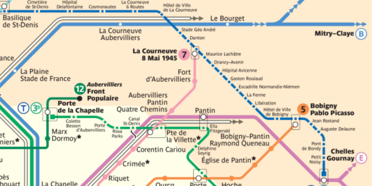
In an earlier version of the Paris Metro map I came across (seen above in the featured image for this post), the T1 line has an uneven dashed line, alternating between squares and dashes (the squares being the station markers).
I thought this looked very good as a line style, and since adding new variants of dashed lines is pretty easy, I thought it was worth doing.
At some point, I'll need to add a way to manage the increasingly large number of line styles available – I'm thinking a button that lets you hide unused line styles (you can always add them back), and while they're hidden, those styles won't show in the menu and the keyboard shortcut Q won't cycle through them.
There might be other/better ways of managing large numbers of line styles and options, and if you have a good idea I'd love to hear it.
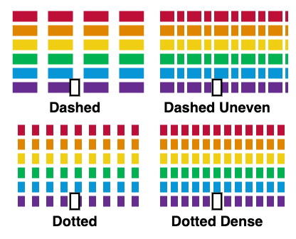
For comparison, here are some of the different dashed/dotted line styles side by side with this latest style I'm calling Dashed Uneven:

How would you use this new line style? Will you use it to show a line that's under construction? An important tram, bus, or train that runs alongside your main system? An express line? Or something else?
I'm really curious to see how you all make use of this and other new line styles. Make sure you're subscribed to email updates so you'll be the first to know when the new version of Metro Map Maker is out, and happy map making!


